How Might We Visualize the Impact of Milestone Changes to Work Centers?

Responsibilities

Product Manager, UX Designer

Collaborators

Allison O'Brien, Ezra Peláez, and Sabrina O'Brien

Project Duration

2 months, 40hrs/week

Tools

Adobe XD, Adobe Illustrator

Overview

Manufacturers are always looking to make their production processes more efficient. I designed a dashboard to empower manufacturers to analyze the impact of milestone changes to their work centers on focus metrics.

This project challenged me to ask thoughtful questions as I navigated presenting to cross-functional teams.

Context

From Numbers to Narrative

In this project, I worked within the Vorne XL IoT Device designed to help manufacturers increase their productivity.

conveyer belt with sensor at the end, sensor connects to cloud network, cloud network connects to data visualization dashboard

The XL Productivity Appliance uses sensors to track metrics on work centers (individual production lines) and connects data to an enterprise-level network. It renders data visualizations and sends reports to help continuous improvement managers form insights about how to improve manufacturing efficiency from work center, to area, to plant, to entire enterprise.

two line graphs, the first trending downward, the second upward, with a milestone icon in the middle

My role was to empower operators, line supervisors, and continous improvement managers to analyze the impact of milestone changes to their work centers on focus metrics.

Target Users

One System, Three Jobs to be Done

Manufacturers strategically make changes to their production processes and measure key metrics to see if they make production more productive. These changes are planned, implemented, and monitored at different levels through employees of different roles.

Operators

Operators are responsible for operating the machinery at the work center to build a product. When a change is made to process, they are responsible for implementing it.

Line Supervisors

Line Supervisors are responsible for directing the operators at a work center. When a change is made to process, they communicate between the continous improvement manager and operators to strategically direct implementation.

Oftentimes, line supervisors will also take on the roles and responsibilities of the continuous improvement managers.

Continuous Improvement Managers

As their title suggests, Continuous Improvement Managers are responsible for tracking productivity and looking for ways to make manufacturing processes more efficient. They identify focus metrics to improve, devise a strategy, and analyze its impact.

User Need

Continuous Improvement Managers need a way to communicate with Line Supervisors and Operators to direct milestone changes to improve focus metrics, recording and analyzing the impact of these changes.

Design System

Less is More

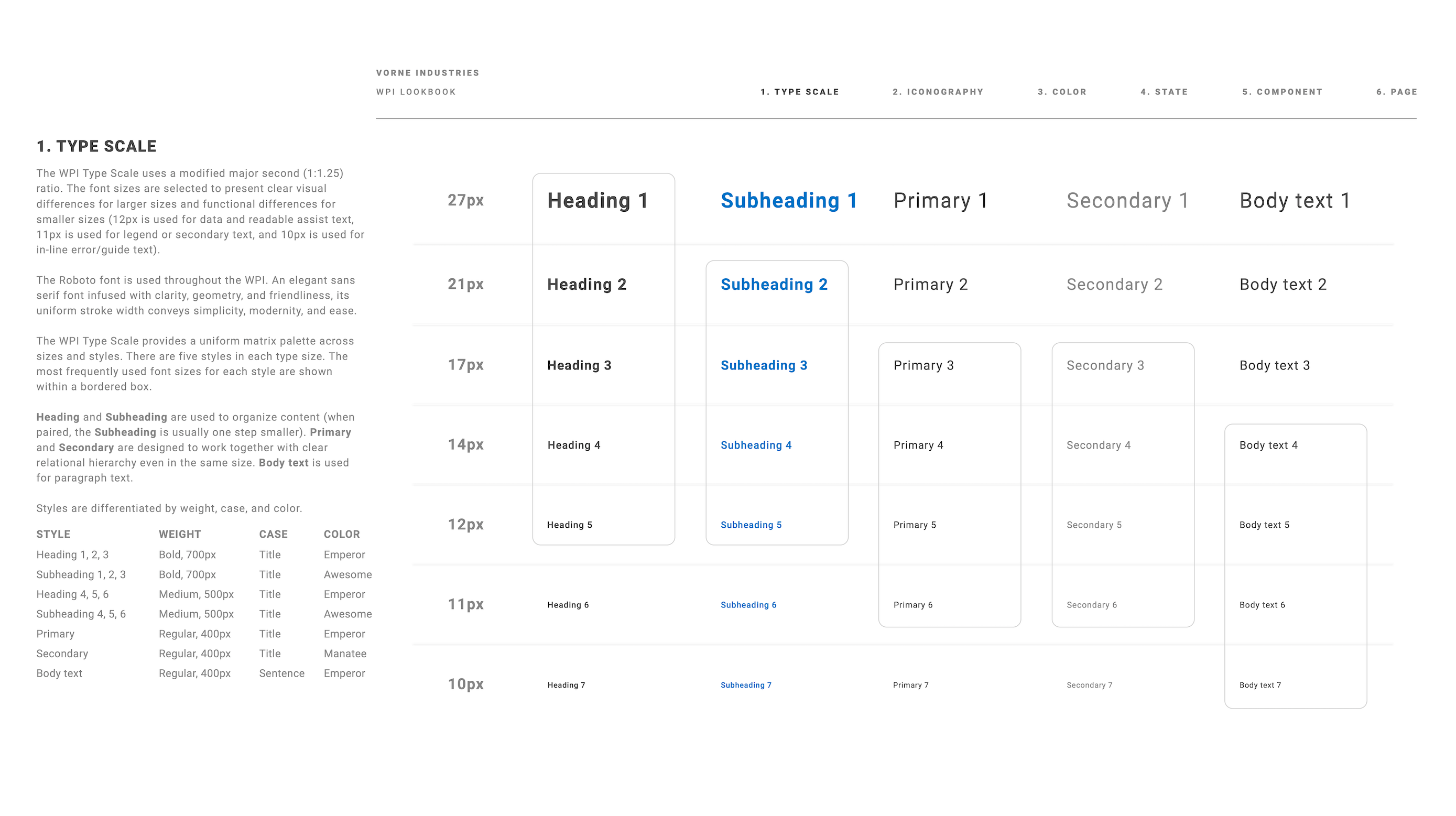
Type Scale Documentation

When I started working with Vorne, the XL interface had at least 100 different typography styles.

Working with Ezra Peláez and Sabrina Vorne, we narrowed this down to 21 intentional and versatile styles. It was limited enough for each style to be distinguishable to the user and draw patterns in heirarchy and app behavior, yet versatile enough to cover any use case.

We supplemented the styles with clear documentation about the use cases for each style to ensure a consistent and meaningful experience.

Mental Model

Familiar View, New Functionality

Much in the way the Milestones page is meant to analyze the impact of a change to the production process on a specific focus metric, Dashboards is meant to break down a sepecific metric and show how it has changed over time.

To make "Milestones" discoverable and easy to understand, Allison and I grounded its features in the popular "Dashboards" page. Rather than creating new widgets to represent milestone information, we re-framed existing widgets Continuous Improvement Managers already understood well.

Time Range Selection
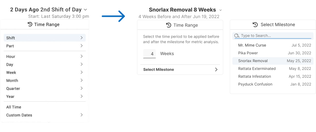
Comparison between Dashboards time range selector in which user can select any date range, versus milestones time range selector in which user can select a number of weeks before and after a selected milestone.

On the Dashboards page, users could choose any time range over which to review their focus metric. In order to accurately represent the impact of changes, on the Milestones page, I optimized the time range selector limiting users to a symmetrical and longer-term view allowing them to choose only the number of weeks before a selected milestone.

KPIs

Comparison between Dashboards KPIs and Milestones KPIs

Short for Key Performance Indicators, these widgets capture the highest level of information of a given metric over the selected time range: the average value, trend, and an indication of whether the value is good, bad, or neutral.

On Dashboards, these KPIs were populated with a focus metric and its component metrics or related metrics. For milestones, we broke the metric down by average before and after a given milestone paired with the percentage change between the two.

Metric Over Time
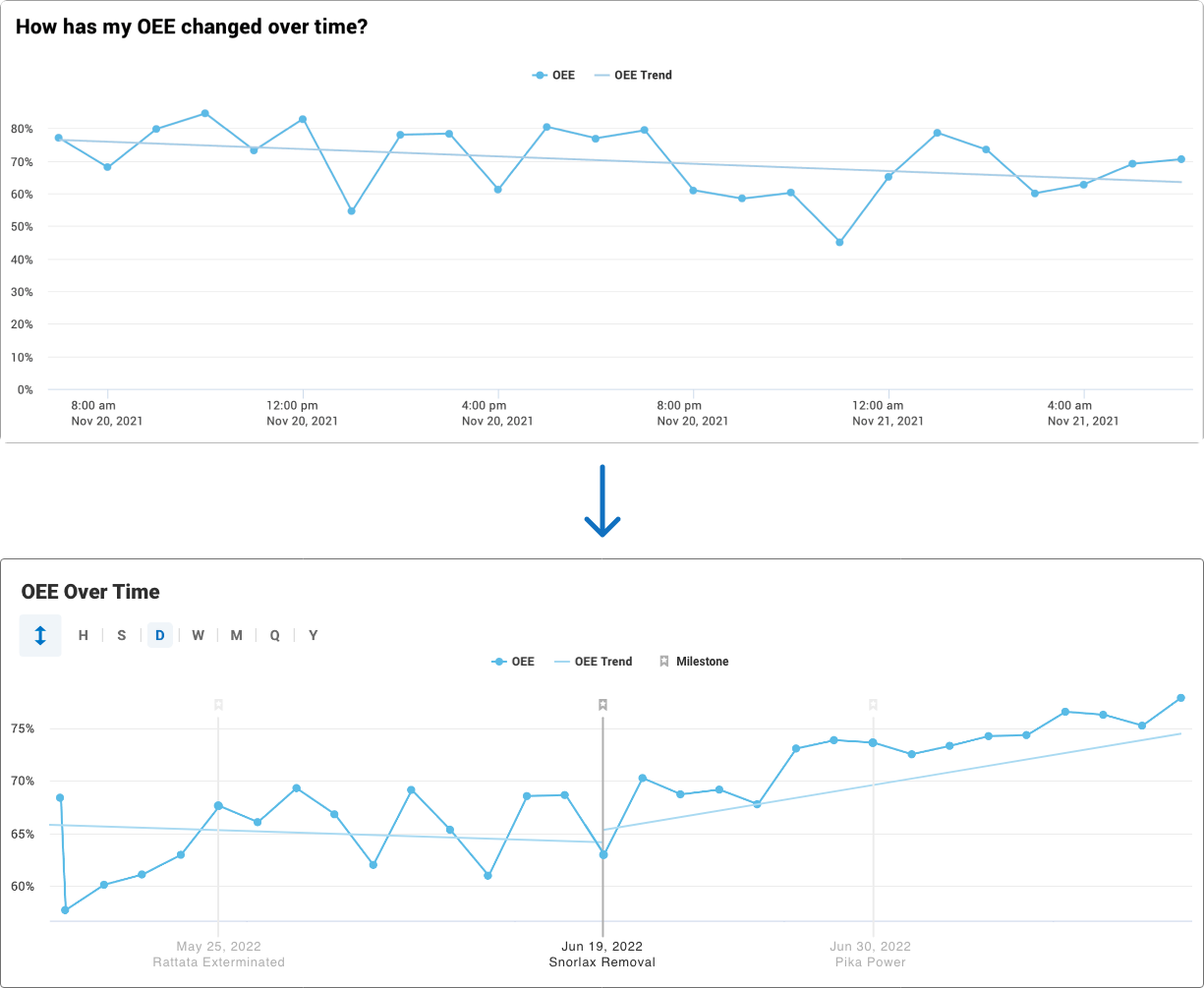
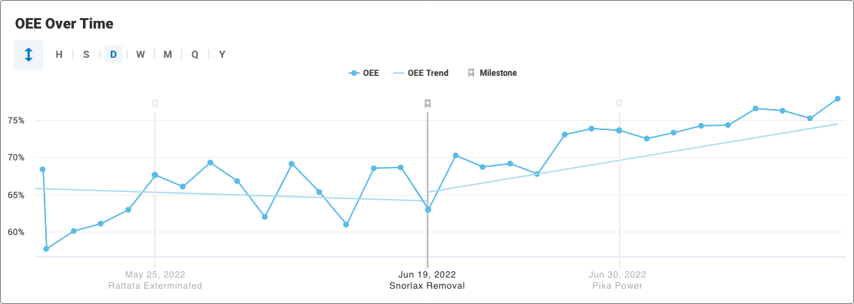
Comparison between Dashboards line graph and Milestones line graph. Dashboards' graph is a typical line graph over time with one trend line. Milestones' Graph is a line graph with the Milestone marked and labelled at the center with equal time scales before and after. There are separate trendlines for before and after the milestone.

Dashboards also present the focus metric in a line graph to show how the metric has varied over time. This helps the Continuous Improvement Managers understand trends relative to noise in the data. This breakdown is particularly useful for Milestones, depicting the relative change in individual data points compared to the overall change, as well as the shape of the curve of changes after implementing a given milestone.

Data Visualization

Honestly and Accurately Presenting Information

Normalized Metrics

Many key metrics considered in manufacturing productivity naturally vary over time. For example, some work centers will alternate between producing, say, Product A and Product B. It would be misleading to say that the count of Product A produce increased when the number only increased because they were producing less of Product B. Normalized metrics are ratios that ensure comparing over different periods of time is not misrepresentative.

For the milestones feature, we limited focus metrics to normalized metrics because they are compared over time.

Peripheral Milestones

line graph with the Milestone marked and labelled at the center with equal time scales before and after. There are separate trendlines for before and after the milestone. Other milestones within the time range are shown in a lighter grey color to show that they are peripheral.

In order to provide context for the current milestone, as well as more accurately portray the cause of changes in metrics, the line graph of the change in focus metric over time shows other milestones on the given work center within the time range. This ensures that the data is not misinterpreted or attributed to one milestone when the change might have been caused by another. It also helps manufacturers analyze and compare a series of changes.

Impact on Key Metrics

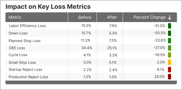
Table showing metrics in the categories of OEE and Six Big Losses, with columns of metric, before, after, and percent change

Another important dimension to consider is how the change impacts other key metrics. This helps tell the full story of what component metrics could be causing changes in the focus metric. It also alerts the manager if the focus metric is improving at the expense of other important metrics.

Discussion

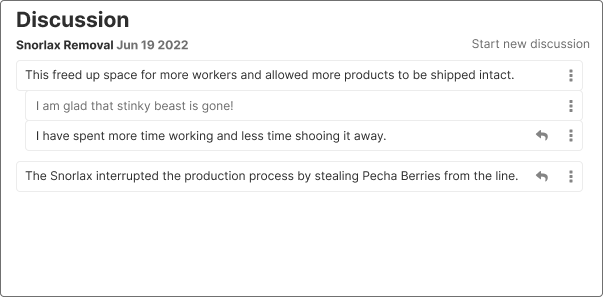
Discussions section with multiple comments, including nested comments, describing the impact of the milestone change

The discussion section makes space for communication between managers and operators, ensuring large-scale data points are supplemented by valuable personal experience with the impact of the change taking the feature from numbers to a full narrative.

High Fidelity

The Final Milestone

Putting the new dashboard together, I came up with the following MVP:

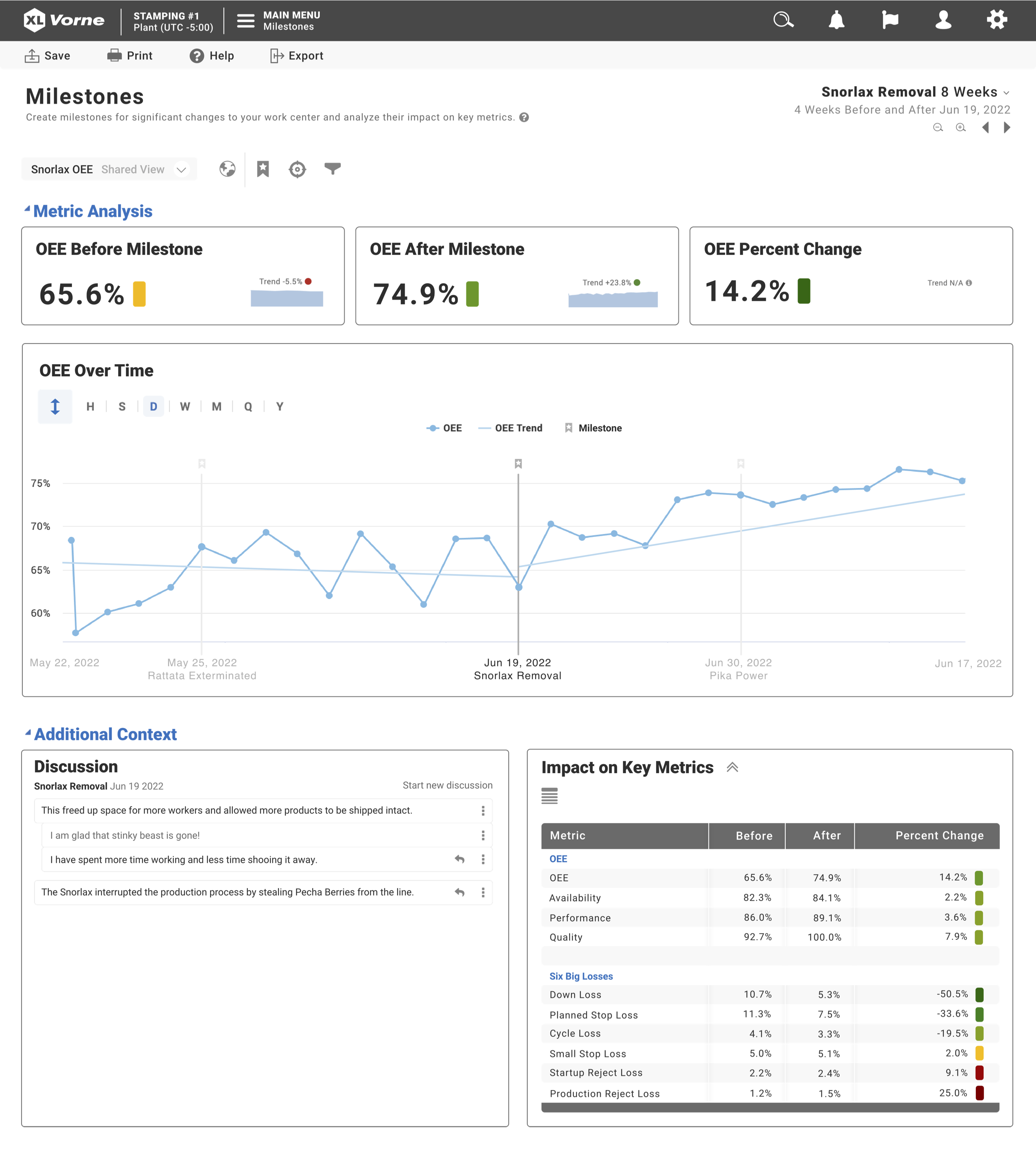
Milestones Page. Row 1: KPI Widgets for OEE Before, OEE After, and OEE Percent Change. Row 2: line graph widget for OEE over time. Row 3: Discussion section with comments and table with impact on key metrics.

The dashboard starts with a high level overview of how the milestone impacted the focus metric, and gradually adds more context, showing a breakdown of how exactly the metric changed over time with respect to other milestones, then zooming out further to the dimensions of discussion of personal experience and other key metrics.

Takeaways

Asking Thoughtful Questions

Throughout this project, I had the opportunity not only to collaborate with the Sales and Customer Success teams to define project requirements, but also to lead meetings with the engineering team.

I will never forget the blank stares I got after asking the Engineering team if the feature was feasible after presenting to them for 20 minutes straight.

Quickly, I learned to break down the presentation based on different dimensions of implementation. I learned to make presentations more collaborative, asking thoughtful questions throughout. I also learned to have empathy in the way I posed questions, first ensuring it did not make any assumptions, then considering whether it would be an easy question for them to answer.

Finally, I learned to make space for thoughtful silence. I've found that often even if I'm met with silence, if I'm patient, someone will either come up with a throughful answer or kindly reframe the question to better communicate what is on their mind.