How Might We Unify the Experience for Sales Reps of Two Merging Companies?

Overview

After the Zurn and Elkay merger, sales reps had to manage multiple sales enablement platforms. I redesigned the sales interface between reps and Zurn-Elkay to fit seamlessly into their workflows and reinforce the unified brand.

This project challenged me to be relentlessly curious and resourceful while testing assumptions to maximize limited opportunity for feedback from busy users.

Role

UX Designer, UX Researcher

Project Duration

3 months, 30hrs/week

Collaborator

Sharon Thomas, Senior UX Designer

Tools

Figma, Microsoft Clarity, Maze User Testing

Context

Once upon a time, Zurn and Elkay merged and lived happily ever after, right?

Yes, but before they lived happily as one Zurn-Elkay, it was my role to help bring the sales representatives of these two brand families together through a unified sales-enablement platform.

Zurn and Elkay Logos combining to form one Zurn-Elkay

Zurn used a third party sales enablement solution, while Elkay developed “RepMyElkay.” Each of these tools had the same purpose for our teams: to provide sales representatives with order search tools and educational reference materials.

Place of our solution in network with Sales Reps' current workflow

The system I was tasked with designing would be a based on the internally developed RepMyElkay, keeping in mind the structure and functionality Zurn Reps were used to.

Target User

Understanding Sales Reps’ role in the Zurn-Elkay Business Model

To thoroughly understand the context of Zurn-Elkay Sales Reps’ roles, I mapped the ecosystem to which they belong:

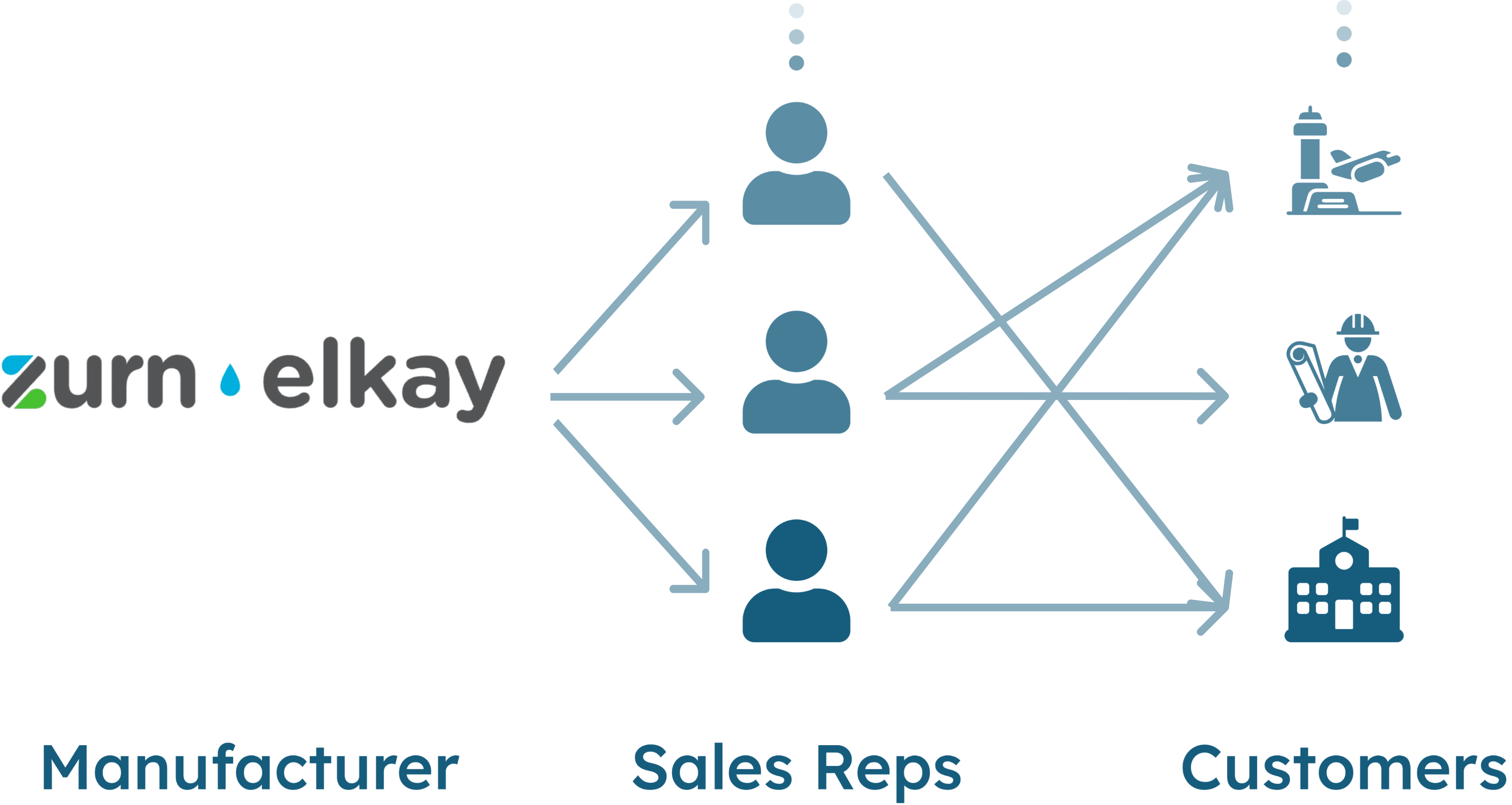
Channel marketing model diagram

Zurn-Elkay has an indirect sales model in which they work with channel intermediaries to distribute their products to many different types of customers.

Diagram depicting Sales Rep Experience working for many brands inside and outside of the Zurn-Elkay Family

The sales reps at these independent distributors work with brands inside and outside of the Zurn-Elkay family, so it's crucial that our system not only provides tools and information, but also reinforces brand values and builds trust in our partnership.

Discovery

RepMyElkay: An Origin Story and a Cautionary Tale

To understand reps’ experiences with RepMyElkay, our current platform, I used data available from Microsoft Clarity. By analyzing heatmaps of user clicks and recordings of user sessions, I was able to piece together valuable insights.

Heatmap of homepage showing 40 percent of users first using order search and 25 percent first using library (reference materials hub).

Sales reps exhibited cognitive overload on the homepage, most hovering over different options for 3-5 seconds before taking action.

Most reps completed a single task per session, typically checking order information or downloading specific reference materials, leaving the platform immediately after.

Together, this indicates that reps use “RepMyElkay” as a reference tool and with a specific goal in mind, but struggle to identify the best path to accomplish their goal on our current platform.

User Need

Sales Reps Across all Zurn-Elkay Brands Need a Unified Sales Enablement Experience

Because sales reps work for brands inside and outside of the Zurn-Elkay family, our sales enablement platform should follow the standard design conventions of other platforms.

Our initial findings showed that reps had a difficult time discerning the steps necessary through the current platform to accomplish their goals.

Sales Reps Across all Zurn-Elkay Brands Need a Unified Sales Enablement Experience that works like other platforms, because they have a goal in mind when they use our platform, but struggle with execution, which builds frustration associated with our brand and hinders their ability to sell our products.

Competitive Analysis

Competitive Analysis and Scope Creep

We started our competitive analysis with the third party Sales Enablement Platform Zurn used prior to the merger.

This platform is successful in having a clear navigation with task-focused pages.

This platform included usage analytics which confirmed that the reps’ two main jobs to be done were order search and reference material download, even among more features available to reps on this platform.

The platform effectively supports these tasks with:

  1. A central navigation
  2. Pages dedicated to a single task
  3. Visual categorization of reference materials

The main drawbacks of the platform were:

  1. Features irrelevant to our team cluttering the interface
  2. Inefficient search and filter options
  3. Enterprise pricing that increases with the number of accounts

From our competitive analysis, we concluded that while its advanced functions like previewing and saving drafts are beneficial for content writers, they add complexity beyond the needs of our team and outside the scope for our sales reps-focused minimum viable solution.

Design Strategy

An Action Plan

From our research, we concluded that could better support sales reps who need a unified Sales Enablement Experience that works like other platforms by making the following changes to RepMyElkay:

  1. Central Navigation with detailed headings
  2. Industry standard naming conventions and organization
  3. Visual representation of reference materials
  4. Task-focused information architecture optimized for the common use case

Styles

Professional ≠ Bland

In the first high-fidelity prototypes I designed, I focused on functional UX Design rather than UI style details. Admittedly, I was also a bit hesitant to be more playful with the design of a tool used in a professional setting.

Although the system met the functional needs of the reps, the style did not take into account the emotional need to build a relationship with the Zurn-Elkay Brand they represented.

Interface with only navy and grayscale colors and rectangular footer versus Interface with Zurn-Elkay branded blues and greens and a wave-shaped footer

To foster a sense of pride in the organization, I incorporated more brand colors while staying within WCAG2 Accessibility color contrast guidelines. I also incorporated the theme of water and sustainability in the wave-shaped footer.

Checking Assumptions

Watching Out for Current Usage Bias

We initially assumed a mobile version of the platform was unnecessary based on data showing no site usage from these devices. However, looking at the context of when and where sales reps use sales enablement platforms revealed that sales reps often need access to info on the go or in the field.

Loading RepMyElkay on a mobile device revealed a messy, non-functional home screen. Microsoft Clarity data showed a 100% bounce rate on mobile, indicating unmet demand for a mobile version.

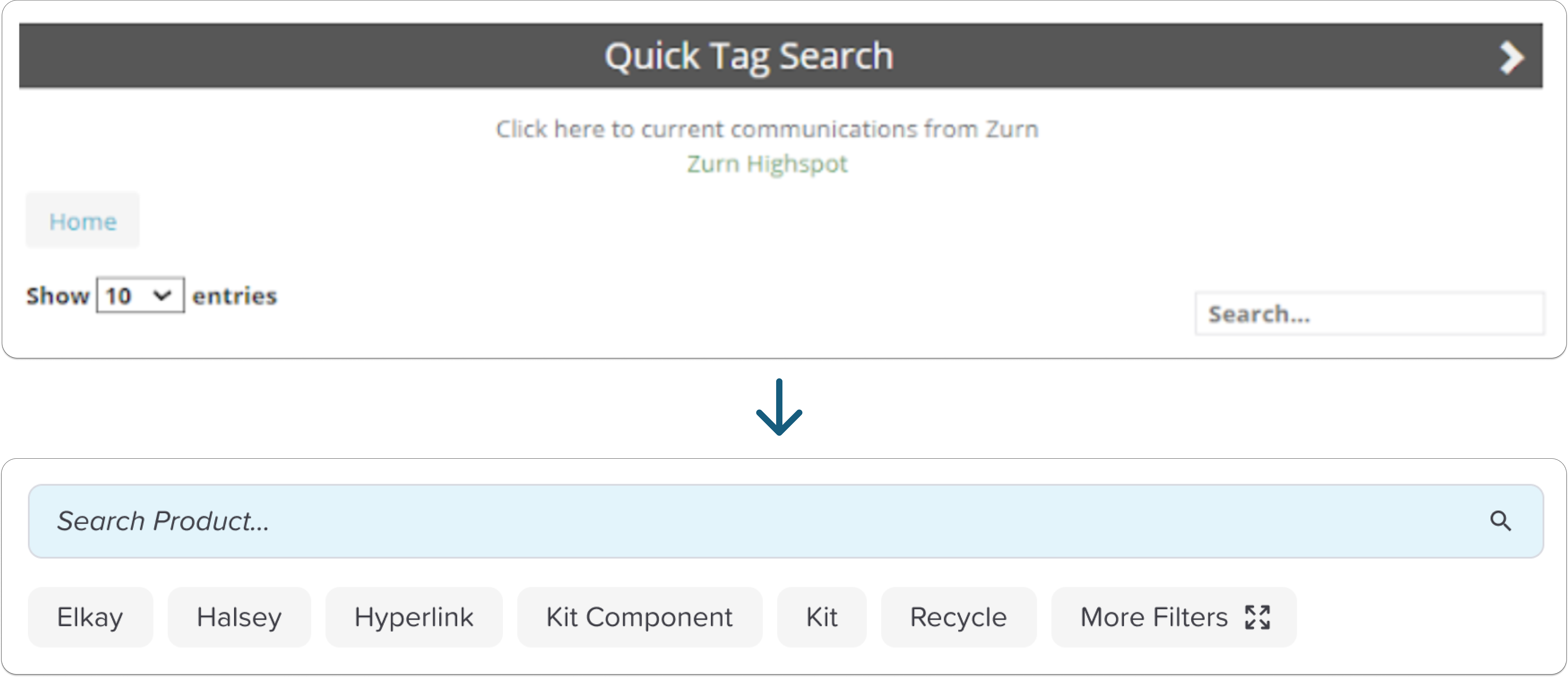
Similarly, the quick tag search feature saw little use because it was buried. Once we brought it to the forefront of the search experience, modeled after Google's tag search, its usage increased significantly and reps found information more quickly.

Comparison between RepMyElkay and ZE Rep Portal that shows quick tags buried under extra clicks versus brought to the forefront next to the search bar.

Library search interface in RepMyElkay versus Our Solution.

Usability Testing

Checking our assumptions with Usability Testing

Without the opportunity to interview reps directly, it was imperative that we test our design assumptions.

Nine of our sales reps completed two tasks on the prototype modeled after their two key jobs to be done: checking order information and downloading reference materials.

Our research goals were to understand the following:

  • Have we reduced the initial cognitive load?
    Measure: time to first action
  • Are reps able to efficiently complete tasks?
    Measures: binary task completion, path, task completion time
  • What enabled task completion?
    Measure: select all that apply
  • What hindered task completion?
    Measure: select all that apply
  • What could we improve?
    Measure: Free response

Information Architecture

User Experience Goes Beyond the Interface and into Information Architecture

After running usability testing, Sales Reps indicated that they were happy with the core components of the interface design. They were able to make decisions and complete tasks faster than using “RepMyElkay.”

That being said, some still had a negative experience downloading specific reference materials.

"This makes assumptions that users know where to look for these items, only a seasoned rep would know where to look."

- Zurn-Elkay Sales Rep

Our usability testing uncovered a pain beyond the interface we designed. The way reference material files were currently organized was not clear to reps.

After this testing, we worked with the marketing team to audit all reference materials housed in the library and reorganized the file structure to create more obvious groupings, then set standards for how new files could be named and where they should be stored.

Impact

Ever After: The Impact of a Unified Zurn-Elkay Sales Enablement Platform

Thoughtfully organized information and interface makes it easier and faster for reps to search order info and download reference materials. Our responsive system makes the tool accessible on the go and in the field.

Creating a better experience for sales reps means that they will be able to focus on their role in making sales for Zurn-Elkay. Additionally, developing a solution in-house saves the money we had been spending on Third Party Platform subscriptions and creates a more scalable solution.

Takeaways

Moral of the Story: Be Curious and Test Assumptions

Although we didn’t have the opportunity to directly observe or interview reps, I used my curiosity to sift through swaths of user session data and my empathy to use my knowledge of reps’ roles and context, which allowed me to piece together valuable insights to motivate our redesign.

Watching sessions from current users helped us gain knowledge of how the current tool was being used, but it presented a view biased by the current solution. In order to understand unknown unknowns, it was vital that we tested the assumptions in our designs to come up with some of our most valuable insights, like the importance of having a mobile version of the system and an intuitive information architecture.

Woman thinking with ideas and confetti floating around her and a usability test.